
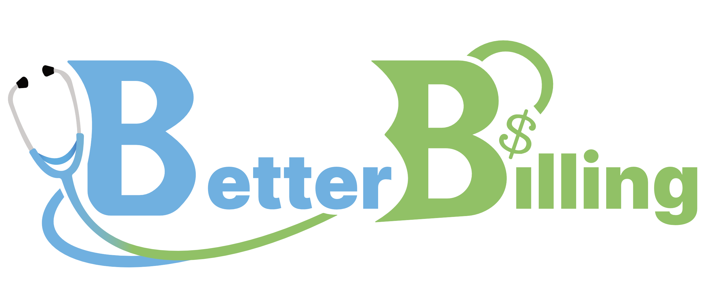
Better Billing
Better Billing engaged me to design a logo for their new invoicing system. As a startup building a specialised software product, they needed a logo that could establish credibility quickly, feel at home in the health and wellness space, and scale cleanly across digital touchpoints from platform UI to pitch decks and web pages.
Year: 2026

Client Background
Better Billing is an early-stage startup developing a software system specifically for health and wellness businesses to simplify billing and invoicing. Unlike broader practice management platforms that treat invoicing as an “extra tab,” Better Billing focuses on doing this one critical function properly. Their positioning is built around focus and functionality: reducing friction, improving clarity, and helping health-based businesses manage payments with confidence.
Logo Design
This logo design was developed to communicate a modern system and calm confidence. I created a primary and icon logo that felt clean and trustworthy, with a clear balance between professional authority and approachability. Both are important for a product used by health and wellness practitioners who want their admin tools to feel supportive, not stressful.
The design prioritised versatility and legibility, ensuring it could work at small sizes for software interfaces, icons, and favicons, while still holding presence on larger brand applications like presentations, website headers, and onboarding materials. The outcome was a logo that positions Better Billing to grow with the platform as it evolves.