

Aesthetic Doctors Australia
Aesthetic Doctors Australia engaged me to create a cohesive visual identity system for Dr Rakib. It needed to feel sleek, modern, and clinically professional while still reflecting the artistry at the heart of aesthetic medicine. Across the project I designed a simplified logo, established a cool monochrome colour palette, and carried that refined aesthetic through multiple printed brand touchpoints including a pricing brochure, business cards, and a letterbox drop postcard. The overall outcome was a unified visual presence that looks consistent in both digital and print, helping the brand feel polished, trustworthy, and premium.
Year: 2023
Client Background
Dr Rakib’s pathway to aesthetic medicine comes from a love of both the procedural side of healthcare and the creative craft of the arts. He’s drawn to the intersection of precision and beauty.
His background teaching anatomy brings an added layer of strength to his work in facial aesthetics, where detail matters and precision supports safety. For Dr Rakib, the most rewarding part isn’t only the visible results, but the confidence patients carry when they see themselves differently.
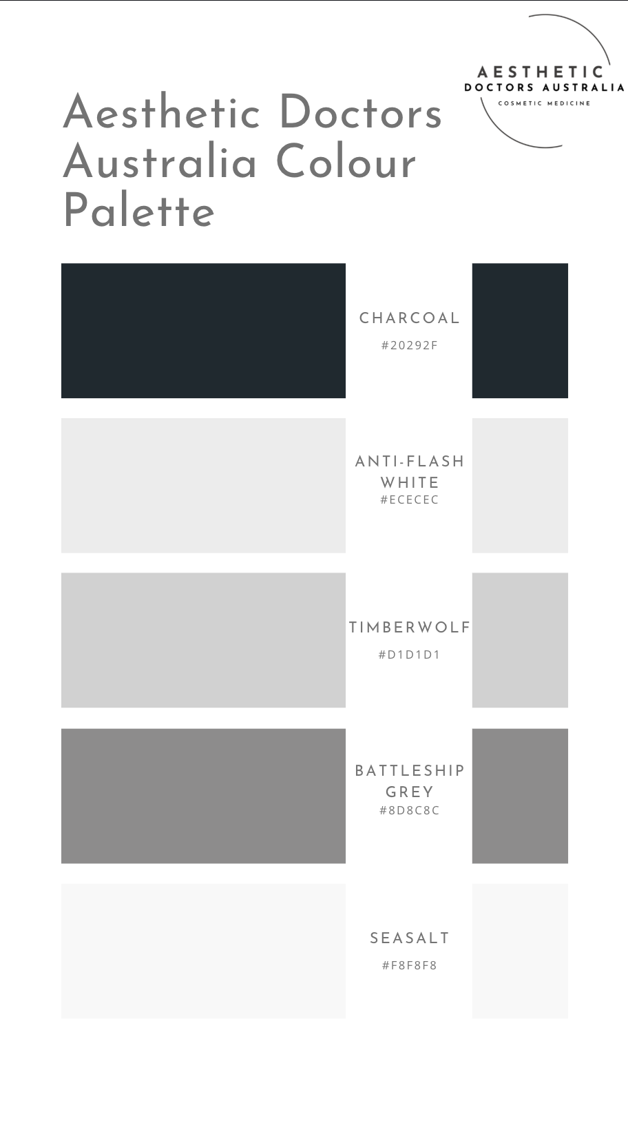
Logo Design & Colour Palette
The logo was designed to be intentionally simple and modern with clean lines, strong legibility, and a structure that could scale across everything from social icons to print collateral. The aim was to create a mark that felt premium and clinical without being cold, aligning with the professionalism of medical practice while leaving space for the subtle artistry of aesthetics.
I also developed a cool, greyscale/monochrome palette to support a sleek, minimal, and high-trust brand presence. This colour approach reinforces professionalism and modernity while keeping the focus on clarity and consistency. The palette was designed to translate seamlessly across print and digital, ensuring the brand looks crisp and cohesive in every application.
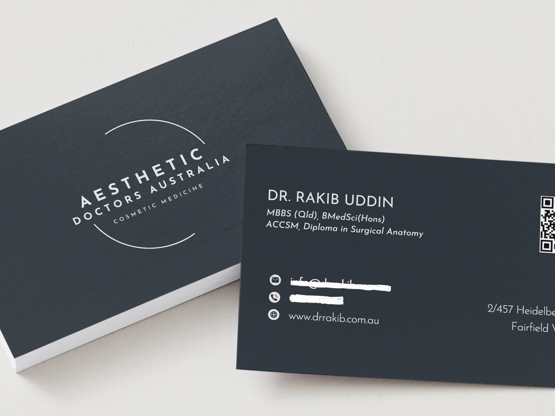
Business Cards
The business cards were created to feel refined and confident. They needed to be minimal, readable, and aligned with the monochrome brand system. Strong hierarchy ensured key information was easy to find in fast-paced environments, while the overall layout and finish presented Aesthetic Doctors Australia (and Dr Rakib) as premium and established at a glance.
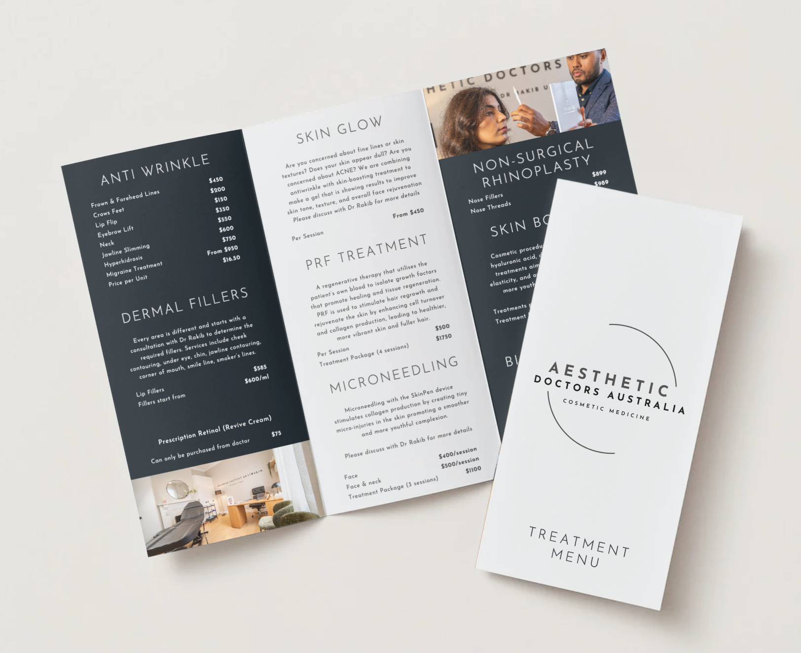
Pricing Brochure
The pricing brochure was designed as a clear, elegant client-facing document that balanced professionalism with ease of use. I structured the layout to support quick scanning, with considered typography, spacing, and hierarchy so services and pricing could be understood without overwhelm. The brochure also reinforced brand trust to help patients feel informed and supported before they ever step into a clinic.
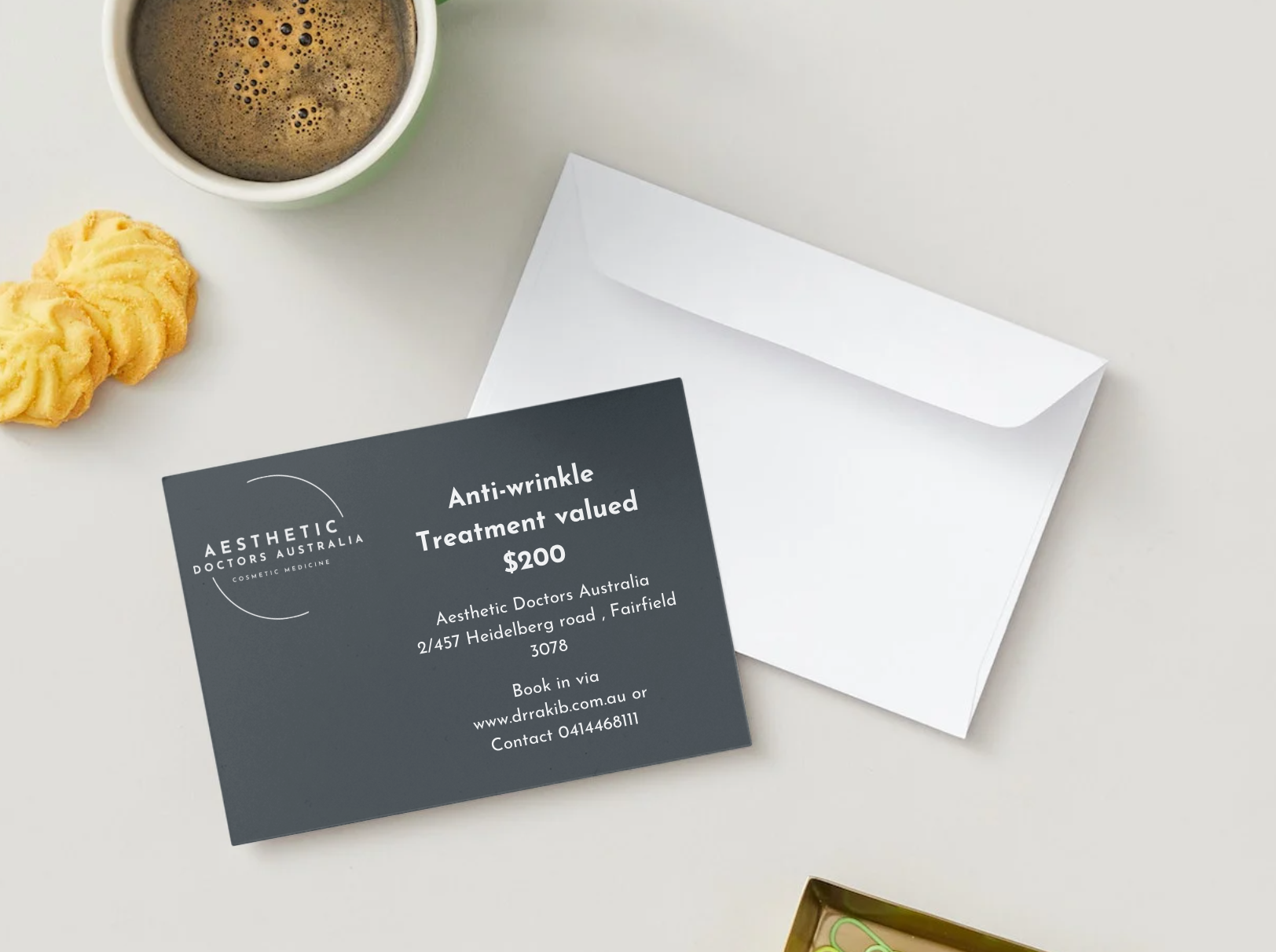
Letterbox Drop Postcards
The letterbox drop postcards were designed to translate the brand into a simple, high-impact piece of local marketing. With limited space, the focus was on clean messaging, strong visual restraint, and a clear call to action. It also needed to maintain the same sleek, monochrome aesthetic while making it easy for recipients to immediately understand who Dr Rakib is, what the practice offers, and how to take the next step.