Swift Architecture
Taylor Swift has never really released “just an album.”
She releases entire worlds.
A Taylor Swift album comes with a colour palette, mood, wardrobe, mythology, type of heartbreak, weather system, and at least one bridge that makes people stare dramatically out a car window as it rains as if they definitively are the main character in a low-budget indie film. The albums certainly are musical, yes, but they’re also spatial.
You can step inside them.
That’s what makes them so interesting from a design perspective.
Architecture does something similar. And… I know it’s been a hot minute since the branding specialist with an architectural degree ACTUALLY spoke about architecture. But it turns values, materials, culture, history, emotion, and function into a built environment. A building tells you how to move, where to look, what to feel, and who it was made for. A artist’s album(s) does the same thing. Except instead of bricks and mortar, it’s sound, lyrics, and narrative.
So, because my brain apparently cannot hear a pop (or I guess country too) album without imaging a floor plan, here is a design-led comparison of Taylor Swift’s albums as architectural styles.
For this article, I’ll be focusing on Taylor’s original studio albums, rather than treating every Taylor’s Version as its own “new building.” The re-recordings feel more like restoration projects: the same architectural bones, revisited with ownership, preservation, and new rooms added on.

Figure 1: Taylor Swift (2006)
Taylor Swift: American Farmhouse (Vernacular Architecture)
Taylor Swift’s self-titled debut feeels like an American farmhouse with a wraparound porch, timber floors, sun-bleached curtains, and a acreage field (or farm) somewhere nearby. The album is rooted in country storytelling: small towns, first crushes, high school longing, and innocence. Architecturally, that fits best with farmhouse and vernacular design. It’s practical, regional, and grounded in everyday life. American farmhouse architecture is often tied to regional building traditions and a more informal functional way of living, which makes it a natural match for the album’s country foundations and front-porch honesty.
This album isn’t trying to be grand and spectacular. It’s not overly polished marble or shimmering glass façades. It’s timber, dust, handwritten notes, and a bedroom window left open in summer. It feels local. It feels young. It feels like the beginning of a story before anyone knows how big the story will become.
Debut is a house built from memory before memory becomes mythology.
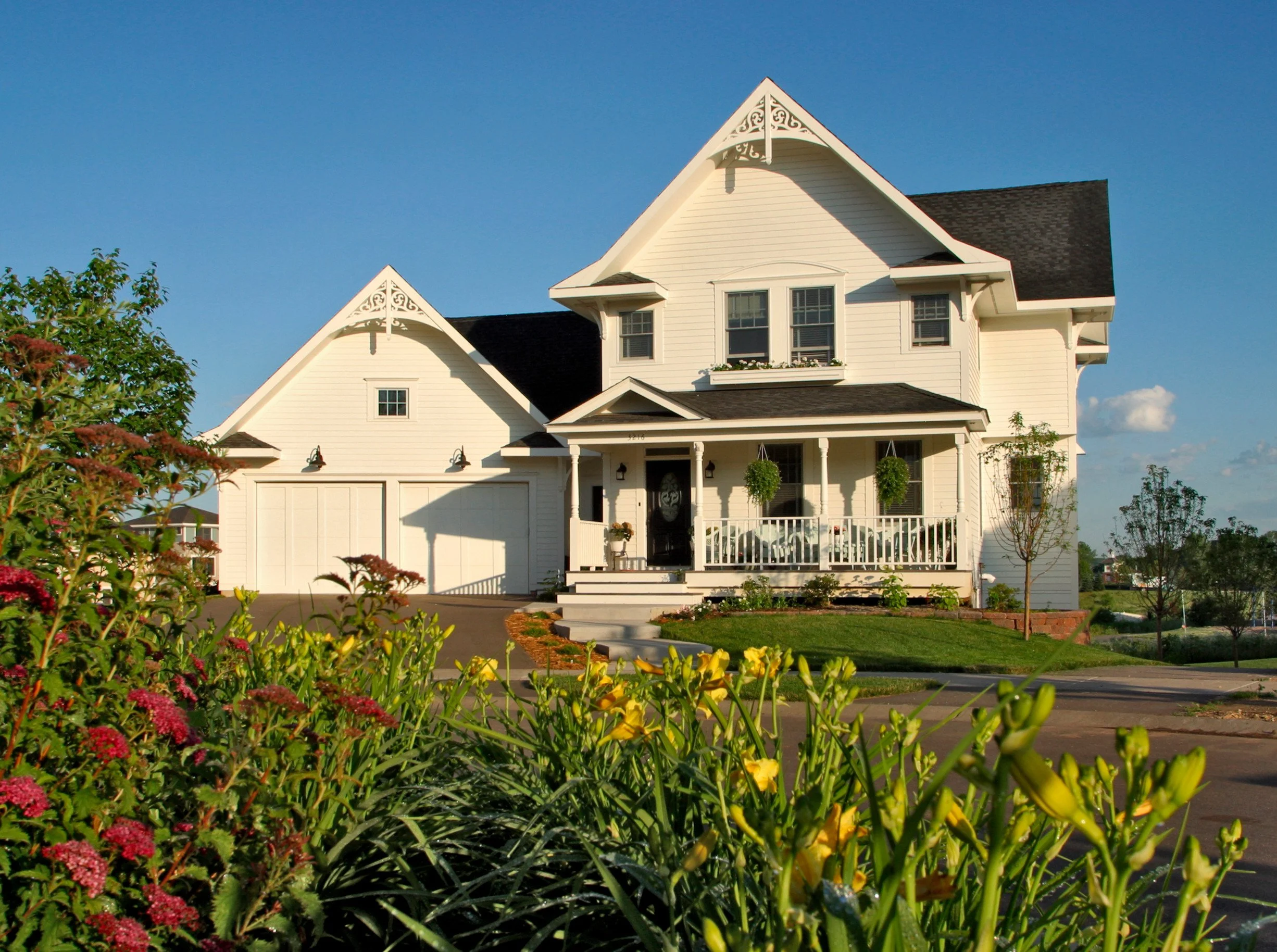
Figure 2: Example of the American farmhouse architectural style

Figure 3: Fearless (2008)
Fearless: Queen Anne Victorian
Fearless is so much more than just young love. It’s young love with turrets.
This album is romantic, idealistic, ornate, and emotionally cinematic. Everything feels heightened: the first kiss, the school hallway, the fairytale ending... and the heartbreak afterwards that feels completely earth-shattering because, at 15… it kinda is. Queen Anne architecture fits because it truly is expressive, decorative, asymmetrical, and completely and utterly full of charm. The U.S. National Park Service describes Queen Anne buildings as playful, varied, and often marked by mixed materials, intersecting gables, turrets, and stained glass. That visual language feels exactly like Fearless: romantic excess, golden light, and ornamentation.
Fearless is a house with a tower you climb because you think someone might be waiting at the top with a bouquet of flowers. It’s dramatic, but sincere. No irony, just yet. No armour, just yet. Just hope wearing a very pretty dress.
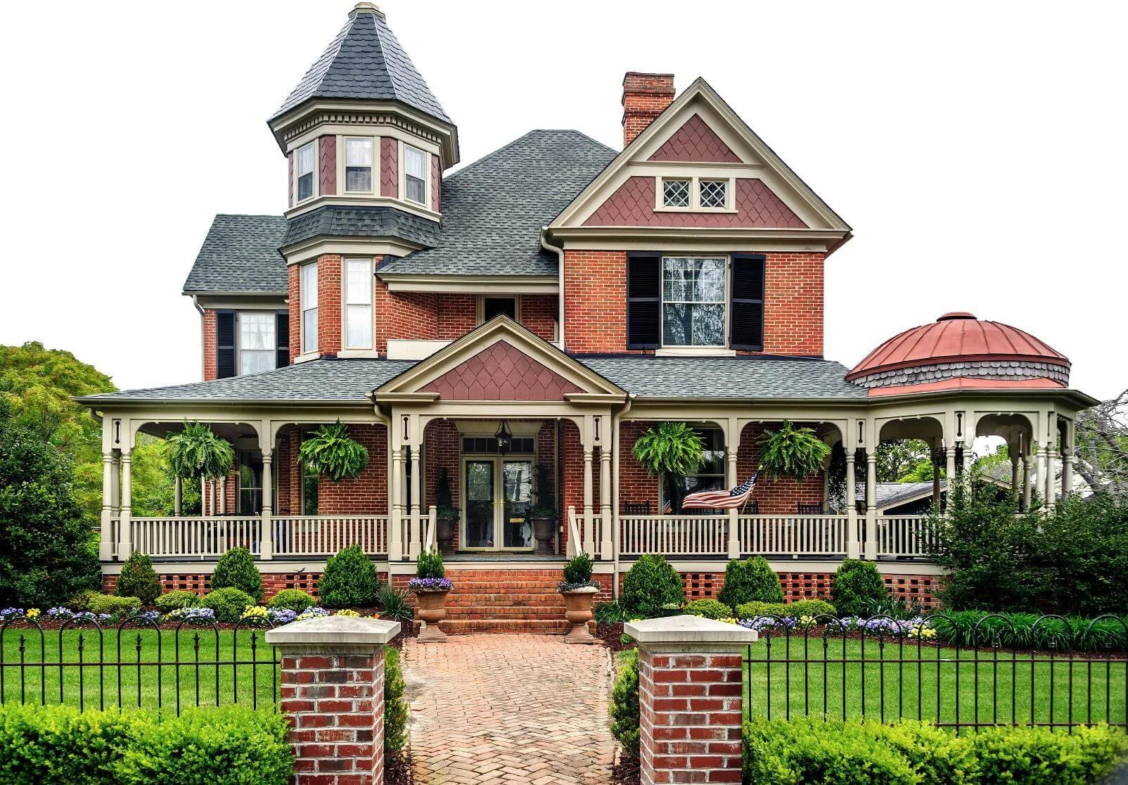
Figure 4: Example of Queen Anne architectural style

Figure 5: Speak Now (2010)
Speak Now: Gothic Revival
Speak now is a Gothic Revival castle with purple stained glass, pointed arches, candlelit staircases, and at least one spooky balcony built specifically for making a speech you have definitely rehearsed seventeen times.
This album is theatrical in the truest sense. It’s self-written, emotionally grand, and full of confession (she really took “speak now or forever hold your peace” literally!). It has weddings interrupted, apologies delivered far too late, revenge served cold, and a kind of fairytale darkness that makes the whole thing feel like a storybook discovered in a dusty attic. Gothic Revival architecture reimagined medieval forms for later eras, often using pointed arches, picturesque massing, and dramatic verticality (Chicago Architecture Centre). That suits Speak Now perfectly because the album is both romantic and haunted. It believes in magic, but it also knows there are ghosts in the halls.
Where Fearless is a fairytale cottage, Speak Now is the whole castle. More self-aware. More willing to let the walls echo. This is Taylor’s “I have something to say, and I’m going to say it NOW” album, and Gothic Revival is architecture that always has something to say. Trust me… quiet buildings do not come with pointed arches.
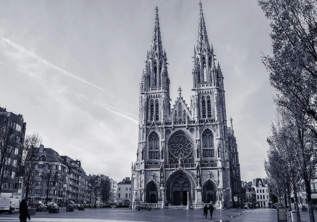
Figure 6: Gothic Revival architectural style example

Figure 7: Red (2012)
Red: Beaux-Arts
Red is a Beaux-Arts train station at rush hour.
People are arriving. People are leaving. Someone is crying on a platform. Someone else is wearing red lipstick and pretending they’re fine. There’s grandeur, movement, and heartbreak. Beaux-Arts architecture is known for symmetry, classical references, monumentality, and civic presence. It’s the architecture of grand arrivals and publicly displayed emotion. The style was strongly associated with monumental public buildings and formal composition, especially in the late 19th and early 20th centuries (Encyclopaedia Britannica). That fits Red because the album is transitional. It’s country becoming pop. It’s private heartbreak becoming public spectacle. It’s intimate and enormous at the same time.
Red is not a small room. It’s a concourse. It’s echoing footsteps, rushing crowds, scarf motifs, and a grand architectural space designed to make departures feel important.
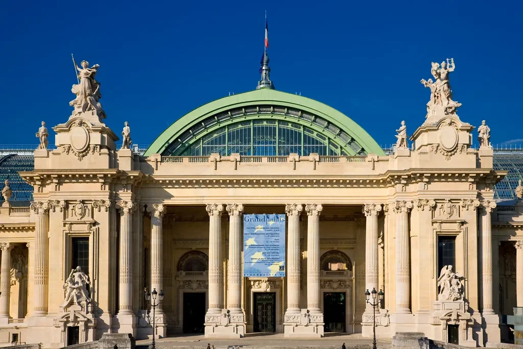
Figure 8: Example of Beaux-Arts architecture

Figure 9: 1989 (2014)
1989: Glass Modernism
1989 is a glass and steel tower with clean lines, a reflective façade, and a city grid stretching beneath it. This is Taylor’s full pop reinvention: sharp, sleek, urban. The storytelling is still emotional, but the form is streamlined. The country porch is long gone. The silhouette is cleaner and the skyline has arrived. Glass modernism, introduced in architectural discourse through the 1932 Museum of Modern Art exhibition curated by Henry-Russel Hitchcock and Philip Johnson, is associated with modernism, functional form, lack of ornament, and the use of glass, steel, and concrete (Chicago Architecture Center). That makes it a strong match for 1989: minimal surfaces, maximum impact.
The album’s pop production feels like curtain wall glazing: reflective, polished, and engineered. Everything is clean-edged. Even the emotional mess has been edited into a perfect skyline. 1989 asks for no approval. It’s already moved to the city, changed the locks, and bought excellent sunglasses.
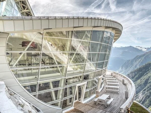
Figure 10: Glass modernism architectural style

Figure 11: Reputation (2017)
Reputation: Brutalism
Reputation is Brutalism…. Obviously!
ANDDDDD… not because I hate Reputation. Or because Brutalism is “ugly” or “harsh,” but because it’s defensive, exposed, sculptural, and powerful. Brutalist architecture is commonly associated with raw concrete, massive forms, and a bold expression of structure and material. RIBA explains Brutalism’s emphasis on raw concrete, scale, texture, and moral seriousness, while MoMA describes it as a mid-20th century style that often eliminated external ornamentation in favour of exposed materials.
That is exactly… EXACTLY Reputation.
The album strips away softness, at least at first glance. It’s defensive architecture; thick walls, industrial weight. It’s a fortress built after public collapse. But Brutalism is not just about toughness. It’s also about honesty of material. It shows the structure. Reputation works the same way. The loudness, snakes, hard edges? They’re not the whole emotional truth. They’re the concrete shell around it. Inside, the album is full of devotioin, secrecy, vulnerability, and finding love in the ruins.
A Brutalist building can look impenetrable from the outside and still hold an unexpectedly tender interior. That’s Reputation’s entire design brief.
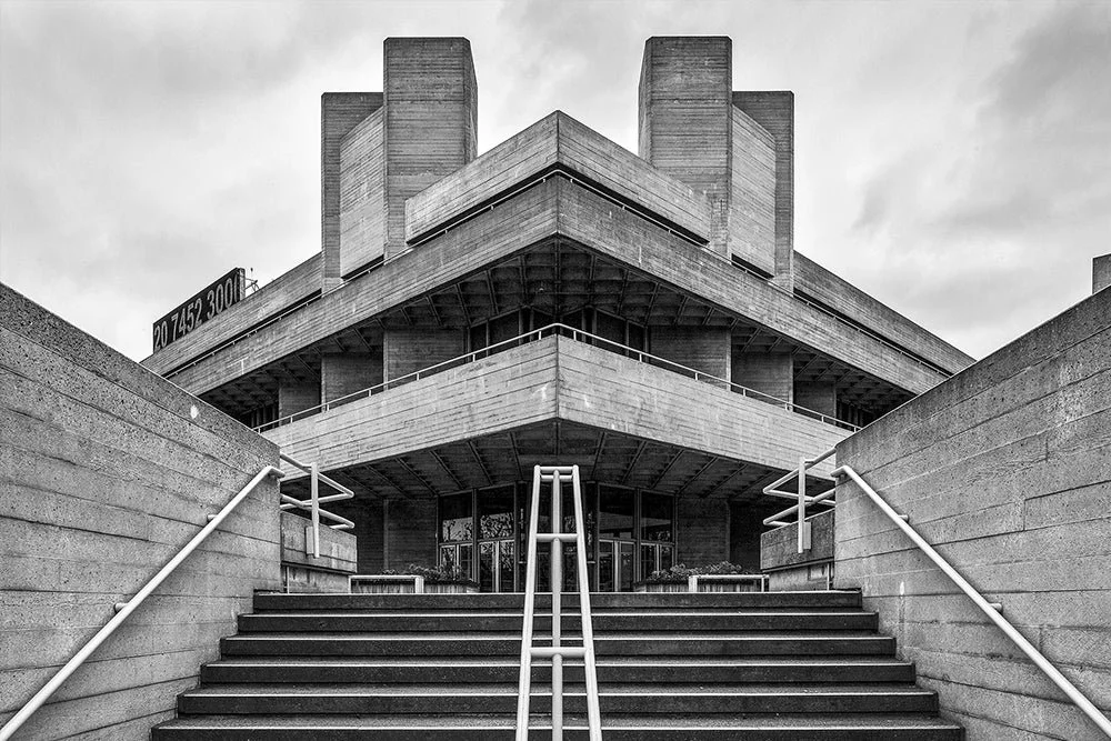
Image 12: Example of brutalism architecture

Figure 13: Lover (2019)
Lover: Post-Modernism
Lover is postmodernism with a pastel façade, heart-shaped windows, a rainbow staircase, and a room that probably… no, definitely has too many cushions. This album is playful, colourful, sentimental, excessive, and deliberately open-hearted. It rejects the black concrete fortress of Reputation and runs directly into colour, romance, and theatrical optimism.
Postmodern architecture pushed back against strict modernist minimalism by bringing back colour, historical reference, irony, and expressive form. Architectural Digest describes postmodern buildings as bold, whimsical, colourful, and full of mixed references. That is Lover: not minimal, restrained, or embarrassed by decoration. The album’s visual world is cotton-candy sky, glitter, pinks, rainbows, and handwritten declarations. It’s intentionally sentimental. Sometimes too much? Sure. But postmodernism also believes “too much” can be a point of view.
Lover is architecture that refuses to apologise for being emotionally decorative.
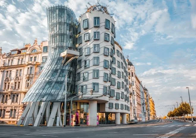
Figure 14: Post-modernism example

Figure 15: Folklore (2020)
Folklore: Arts & Crafts
Folklore in my mind is very arts and crafts cabin hidden among trees, with handmade furniture, visible beams, fog outside the window, and a notebook left open on a wooden table.
Okay… I admit, more of that is an aesthetic than an architectural style.
The album itself arrived in 2020 as a stripped-back, introspective shift into indie-folk storytelling. It feels handmade, quiet, natural, and literary. Instead of pop architecture built for stadium scale, Folklore screams (or maybe whispers) retreat into craft, texture, and story.
The Arts and Crafts movement emphasised craftsmanship, natural materials, simplicity, and a reaction against industrialisation and mass production. The Chicago Architecture Center describes it as a movement focused on handcrafted authenticity, simplicity, and natural materials. RIBA similarly notes its emphasis on traditional building crafts, local materials, function, need, and simplicity.
That’s Folklore’s design language: not polished pop spectacle, but craft.
Woodgrain, wool, weather, myth, memory… It feels like architecture made by hand or I suppose at least made to make you feel the hand behind it.
Folklore certainly isn’t a mansion. It’s a cabin where every creak in the floorboards becomes part of the song.
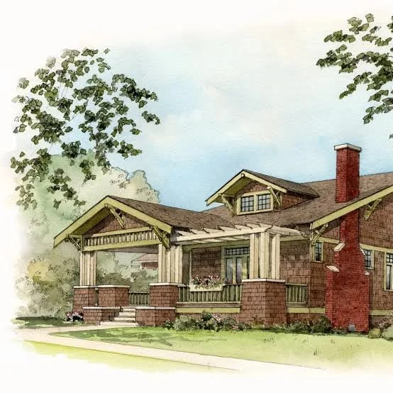
Figure 16: Arts & Crafts architectural style example
Evermore: Tudor Revival

Figure 17: Evermore (2020)
Evermore is Folklore’s older, colder sister: a Tudor Revival cottage on the edge of a forest, with steep gables, leaded windows, ivy, and a fireplace that’s definitely heard family secrets.
Where Folklore is misty and introspective, Evermore is more autumnal, more narrative, and more worn-in. It feels like a house with history. Not ruins, exactly…. More like a place where people have loved badly, left letters behind, and occasionally stared into the far distance while wearing a coat.
Tudor Revival architecture draws from late medieval English building traditions and is often associated with steeply pitched roofs, decorative half-timbering, tall narrow windows, and a romanticised sense of old-world domesticity (Wentworth Studio). That sense of historic texture suits Evermore beautifully.
The album feels less like stepping into a new build and more like discovering a family home where every room has a story. It’s less clean than Folklore. More wine-stained. More complicated. Evermore is architecture that understands memory as a building material.
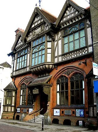
Figure 18: Tudor Revival architectural example
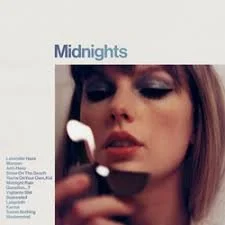
Figure 19: Midnights (2022)
Midnights: Art Deco
Midnights is an Art Deco hotel after dark.
Not the lobby at noon. The lobby at 12:17am, when the brass is dimly lit, the elevator doors glow, and someone in sequins having an emotional realisation beside a velvet sofa.
Art Deco emerged in the late 1920s and 1930s and is associated with vertical lines, geometric ornament, bold colour, glamour, and modern luxury (Chicago Architecture Center). It’s sleek but decorative, modern but indulgent, disciplined but theatrical.
That tension fits Midnights exactly.
The album is glossy, nocturnal, self-reflective, and glamorous in a slightly sleepless way. It’s not the raw woods of Folklore or the concrete mass of Reputation. It’s mirrors, chrome, velvet, skyline views, and the kind of lighting that makes introspection look expensive. Midnights is built from insomnia and polish. It’s architecture for the hours when the outside world is quiet and your inner monologue has unfortunately booked the penthouse suite.
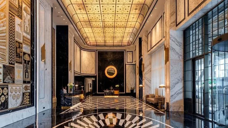
Figure 20: Example of an art deco hotel

Figure 21: The Tortured Poets Department (2024)
The Tortured Poets Department: Neoclassical
Tortured Poets is an old institution: part Neoclassical department building, part Academic Gothic campus, part archive room where the fluroscent lights hum and someone has labelled emotional devastation as “research.”
This album is bureaucratic heartbreak. It has typewriters, files, manuscripts, evidence, post-mortems, and emotional autopsies. The title itself positions pain inside an institution, which is why the architecture should feel formal, literary, and slightly oppressive.
Neoclassical architecture draws on the symmetry, proportion, and classical language of ancient Greece and Rome, often communicating order, seriousness, and permanence (Encyclopaedia Britannica). Academic Gothic, meanwhile, borrows gothic forms such as pointed arches and towers, to create campuses that feel scholarly, historic, and morally weighty.
Tortured Poets sits between those worlds. It’s grand but drained. Institutional but emotional. A place where the columns are beautiful, the corridors are endless, and the paperwork is mostly about heartbreak. This isn’t the castle fantasy of Speak Now. It’s what happens when the castle becomes a university department and everyone inside has read too much into one text message.
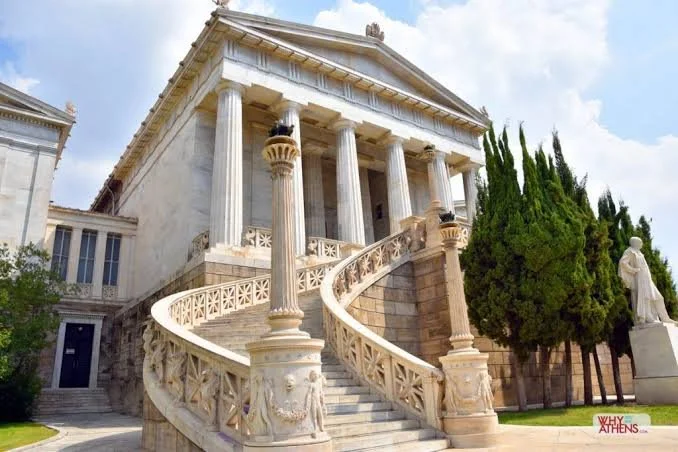
Figure 21: Example of neoclassical architecture

Figure 22: The Life of a Showgirl (2025)
The Life of a Showgirl: Streamline Moderne
Showgirl is an art deco theatre with a Streamline Moderne marquee: chrome edges, backstage mirrors, velvet curtains, theatrical geometry, and a glowing sign out front that says the performance is about to begin.
Taylor’s official website currently foregrounds The Life of a Showgirl as part of her current album era, and Official Charts describe it as a 2025 release that quickly became a major chart event. Clearly you can see the positivity I exude with this album in its description. Either way, architecturally, the showgirl premise belongs in a performance space, but not just any performance. It needs glamour, spectacle, and speed.
Art deco already gives us geometry, shine, glamour, and vertical drama. Streamline Moderne, often considered a later branch of art deco, learned into aerodynamic curves, horizontal lines, and machine-age smoothness (perfeect for a show-business world built around movement, polish, and performance. If Midnights is the hotel after dark, The Life of a Showgirl is the theatre next door: brighter, more public, and more knowingly staged. It understands spectacle not as shallowness, but rather labour with sequins as the uniform.
This is architecture as performance: the facade glows, the backstage is… let’s go with complicated, and everyone applauds before asking how heavy the costume was.
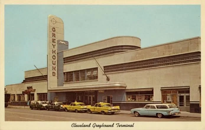
Figure 23: Streamline moderne architectural example
Comparing Taylor Swift’s albums to architectural styles works because both music eras and buildings create immersive worlds. That’s the same reason strong branding matters. Whether you’re designing an album era, building, website, or health and wellness brand, the question goes beyond “does this look good?” and into “what does this make people feel, understand, and remember?” Architecture teaches us that design can hold meaning in form, and Taylor’s eras remind us that people connect deeply when visuals, story, tone, and experience all belong to the same world.
If you want your own brand to feel that cohesive (recognisable, emotionally clear, and built with intention), I can help through brand identity, website design, and social media strategy at Angell Designs. Contact us today to book your free discovery call!