Support Worker Hub
Support Worker Hub came to me for a range of design template deliverables that would help them show up more professionally and consistently across multiple touchpoints. The work included social media content templates, custom email signature designs, newsletter-style brochure template, and business cards. Each were designed to strengthen brand presence, improve clarity of communication, and support ongoing community engagement.
Year: 2024
Client Background
Support Worker Hub, led by Nurse Phill, delivered coaching, training, and community-based services with a strong commitment to health and wellness. Their work centred on supporting businesses and individuals to improve wellbeing outcomes, with a particular focus on care, accessibility, and real-world impact.
Nurse Phill travelled across Australia delivering education and support, building connection through a practical, people-first approach. The brand carried a strong sense of advocacy grounded in genuine care for Australians who needed guidance, services, and community.


Email Signature
The email signature design was created to elevate everyday communication into something more polished, consistent, and trustworthy. Instead of emails feeling like a casual sign-off, the signature became a brand asset reinforcing credibility with every message sent.
I designed a clean, structural layout with clear hierarchy for the business name and byline. I also supported creating an temporary version for the holiday season. The final signatures helped the team present more professionally, support brand recognition, and make it easier for recipients to take the next step.
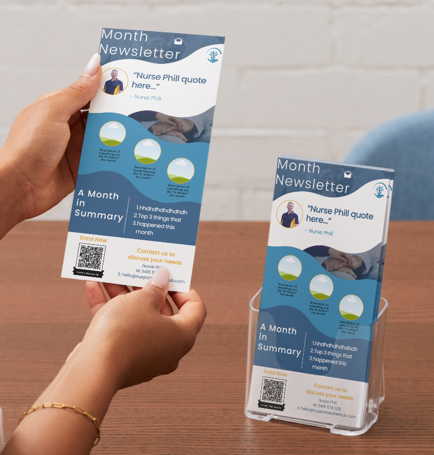
Newsletter Brochure
The newsletter-style brochure template was designed to make information feel engaging and easy to absorb while balancing education with warmth. This wasn’t just another document; it was a piece of brand communication that needed to carry the same clarity and care as the services themselves.
I created a layout system that supported consistent formatting across editions, with strong headings, clear content flow, and purposeful spacing to reduce overwhelm. The brochure format allowed Support Worker Hub to share updates, resources, and community messaging in a way that looked cohesive, intentional, and aligned with their wellbeing-focused mission.
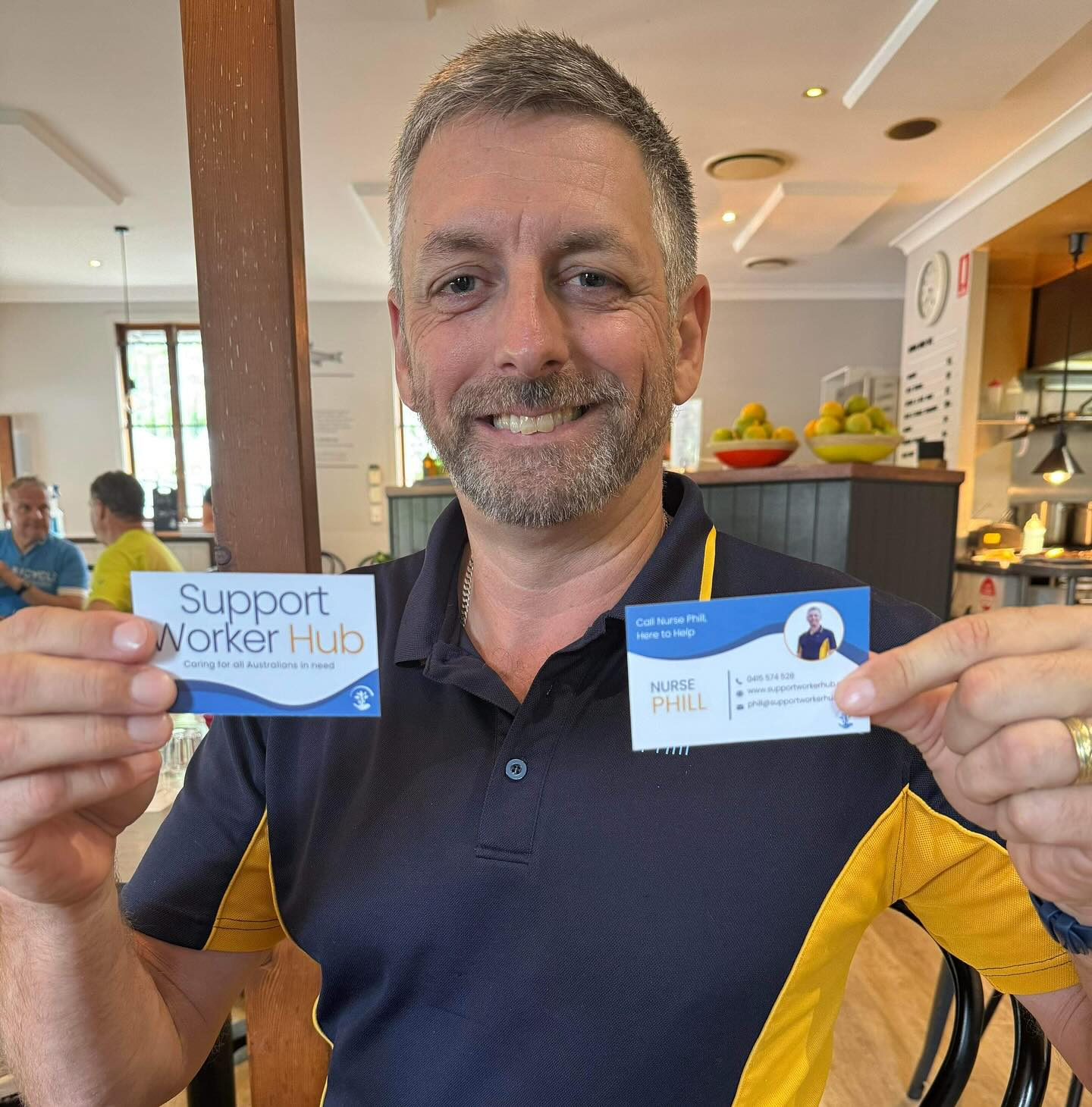
Business Cards
The business cards were designed to give Support Worker Hub a professional, in-hand touchpoint that matched the credibility of their services. Because so much of their work relied on connection (events, community conversations, referrals, and face-to-face networking) the cards needed to be clear, confident, and instantly recognisable as part of the brand.
I created a clean layout with strong hierarchy so the important details (name, role, phone, email, and key links) were effortless to find. The design balanced practicality with warmth, keeping the information easy to scan while still feeling aligned with the health and wellness focus of the business. The final business cards acted as a simple but powerful asset that supported referrals, strengthened trust, and made it easier for new contacts to follow up after meeting Nurse Phill or the team.
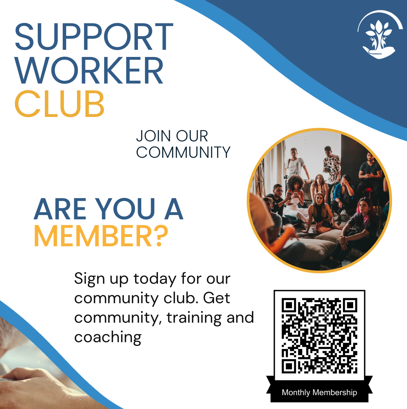
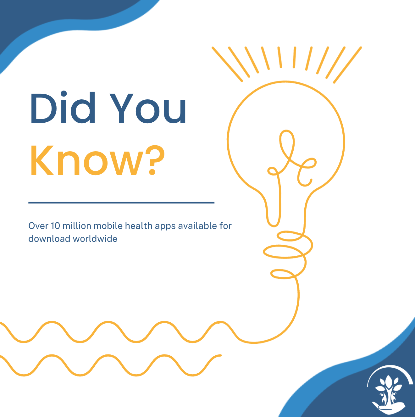
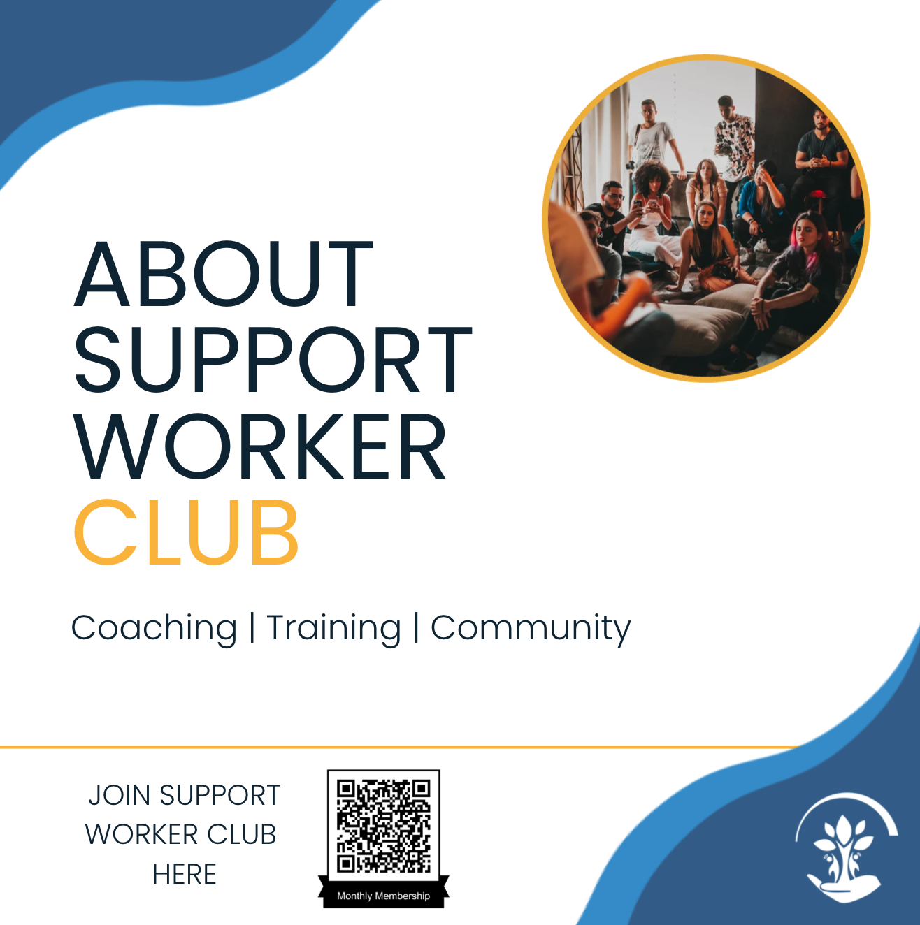
Social Media Content
For social media, the goal was to create templates that looked unified and instantly recognisable, while still being flexible enough to support different message types (education, community updates, service information, and calls-to-action. I developed a set of post styles and templates that made it easier to maintain consistency over time, even when topics shifted.
The content was designed with scroll behaviour in mind: strong visual hierarchy, readable typography, and clear hooks that helped the audience understand the point quickly. The result was a more professional and cohesive presence that supported engagement, strengthened trust, and helped the brand show up with the same confidence online that Nurse Phill brought in person across Australia.