If someone can’t access it, it’s not good design…
Disabilitiasts* Manifesto
-
I’m Sam (they/them). I’m a queer, non-binary, disabled designer and author who’s learnt (often the hard way) what it means to navigate the world through systems that weren’t built with real bodies and brains in mind. I’ve worked across architecture, graphic design, and branding. I bring my lived experience of disability, chronic illness, neurodivergence, and queerness into the way I notice friction and exclusion.
-
My approach is human-first and strategy-led: I don’t just design what people see, I design what people can do especially on low-energy, high-stress, “worst day” days. I design for the nervous system by reducing guessing, lowering cognitive load, and turning complexity into calm through design that holds up over time. Accessibility isn’t a final polish for me. It’s the foundation, because “it works if you’re confident” is not a feature, it’s a warning label.
-
In my design business, I work with health, wellness, allied care, and other human-first services that need trust to land softly. I’m for the organisations and founders who want their brand to match their values: clear, inclusive, and consistent across websites, socials, and the everyday touchpoints where people decide whether they feel safe. If your work is grounded in care and you’re ready to prove it across your forms, language, and systems (not just your aesthetic), we’ll get along just fine.
*person who believes in disability activism
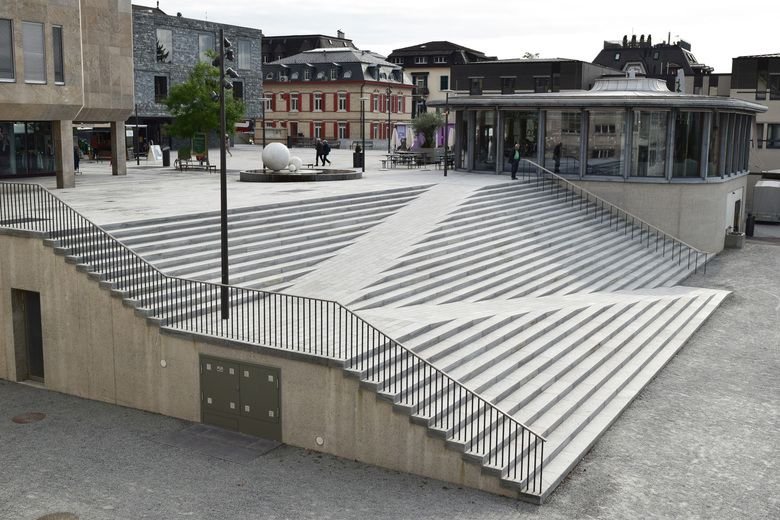
Why Access is Design (Not "Extra")If your design requires confidence to use, it fails the people who need it most.
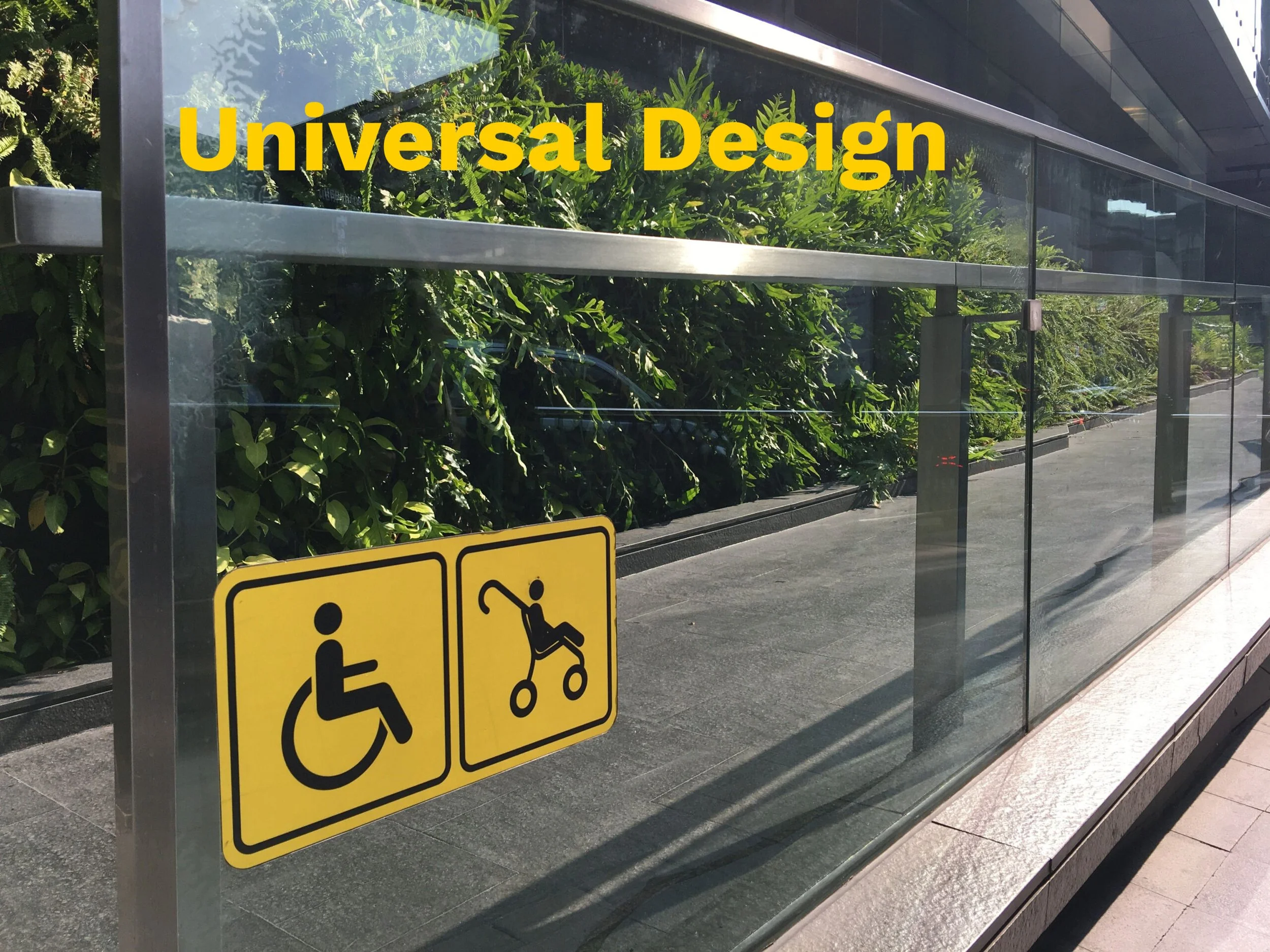
Image 1: McGee (2023)
Access is ethics because design isn’t just arranging shapes or choosing a typeface. It’s deciding who gets ease and who has to pay in extra effort.
Universal design frames this as a responsibility across environments and products, guiding designer toward equitable use and simpler, more intuitive participation (Imrie, 2012; Watchorn et al., 2019). On the digital side, WCAG puts a clear ethical guide underneath it all: if something isn’t perceivable, operable, understandable, and robust… it isn’t truly accessible (W3C, 2024). All in all, meaning the harm caused by inaccessibility isn’t accidental. We need to create systems that ensure accessibility is baked right into the design.
And the real enemy is design that only works for the uninjured, unhurried, neurotypical, confident person because it treats those traits as the admission ticket to basic participation. Inclusive design theory calls this out by showing disability as a spectrum. Permanent, temporary, and situational limits can affect anyone, but good design “solves for one, extends to many” instead of punishing people for being human on any given day (Microsoft, 2024).
This is also why user error isn’t a personality flaw; it’s often a design signal. When people slip, misread, freeze, or abandon a task, the design is asking too much and guiding too little. If your system only works when someone is calm, fast, socially fluent, and/or unafraid to ask for help, it’s selective. That selection is an unethical design choice.
-
The “friction tax” is the quiet invoice design sends to people who are already carrying a lot, until the task costs more than the design outcome(s). I know this tax intimately. When my energy is low, pain is loud, or my brain is foggy, a badly structured form, timeout, or a wall of jargon doesn’t just slow me down. It can flip the whole experience into shame, avoidance, and dropout. This will happen even if the thing I’m trying to access is support I genuinely need.
“Access is not a ramp. Access is the whole building…”
Universal Design backs this up by framing usability as the point: environments and products should be usable by all people, without needing adaptation or specialised “special access” routes. The aim of Universal Design is to reduce unnecessary complexity and reliance on narrow physical or cognitive abilities (Imrie, 2012; Watchorn et al., 2019).
I think of accessibility as hospitality. It should be an invitation. “You’re expected here” looks like flexibility that treats mistakes as part of being human (not a reason to be punished). Inclusive Design reinforces that the hardest exclusions aren’t always visible. Culture and cognition can sometimes be the most challenging barriers. They often get negotiated late in the process (or completely ignored) unless inclusion is on the agenda from the outset (Clarkson et al., 2023).
Accessibility debt is what happens when we treat access like a future problem. Every rushed shortcut doesn’t vanish after you launch. It compounds. Meaning someone else pays the interest in time, effort, and shame. I’ve watched the accessibility debt build in both architectural spaces and brand systems. When access isn’t embedded into the design, it slowly dissolves under pressure and constant updates. Research around Universal Design even describes how hard it can be to define and evaluate what “universally designed” really is in practice. So, without clear application and follow-through, good intentions can still leak exclusion over time (Watchorn et al., 2019).
Compliance to
Care
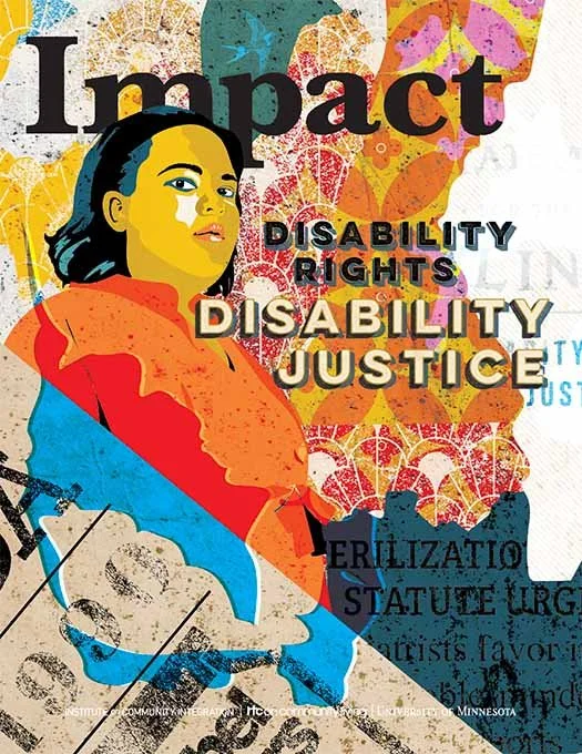
Image 2: “From the Editors” (2018)
This is where the shift from compliance to care matters.
Compliance asks: “Did we meet the minimum?”
Care asks: “Can a real person (tired, in pain, overwhelmed, and/or different) still get through without being made to feel like the problem?”
The built environment doesn’t just shape movement. It shapes health, social participation, and human rights, and exclusion reduces people’s ability to participate in community life (Watchorn et al., 2019). Inclusive design scholarship puts it quite bluntly: “people are disabled by designs and environments that ignore the full range of human capabilities, and designers often default to able-bodied assumptions unless they deliberately unlearn them” (Clarkson & Coleman, 2010; Keates et al., 2000).
Disability justice pushes the lens wider once again. Berne et al. (2018) suggests that access is collective, intersectional, and bound with dignity, sustainability, and interdependence. It’s not some private favour granted to individuals who can prove they “need it.”
So… access isn’t my checkbox. It’s my stance: design should stop asking people to earn entry!
Types of Access I Design For
-
![]()
Physical Access
FATIGUE | PAIN | SEATING | THRESHOLDS | DETOURS
I design for bodies that experience fatigue and pain, not just bodies that can move quickly and stand forever. I plan spaces and touchpoints with seating, rest points, clear circulation, and no “accessible detour around the back” energy.I treat thresholds, distances, and doorways like design decisions with real consequences, because that’s exactly what they are. My goal is simple: people should be able to arrive, stay, and leave without their body paying extra.
Image 3: Studio Vulkan (2013)
-
![]()
Sensory Access
GLARE | NOISE | MOTION | CLUTTER | OVERSTIMULATION
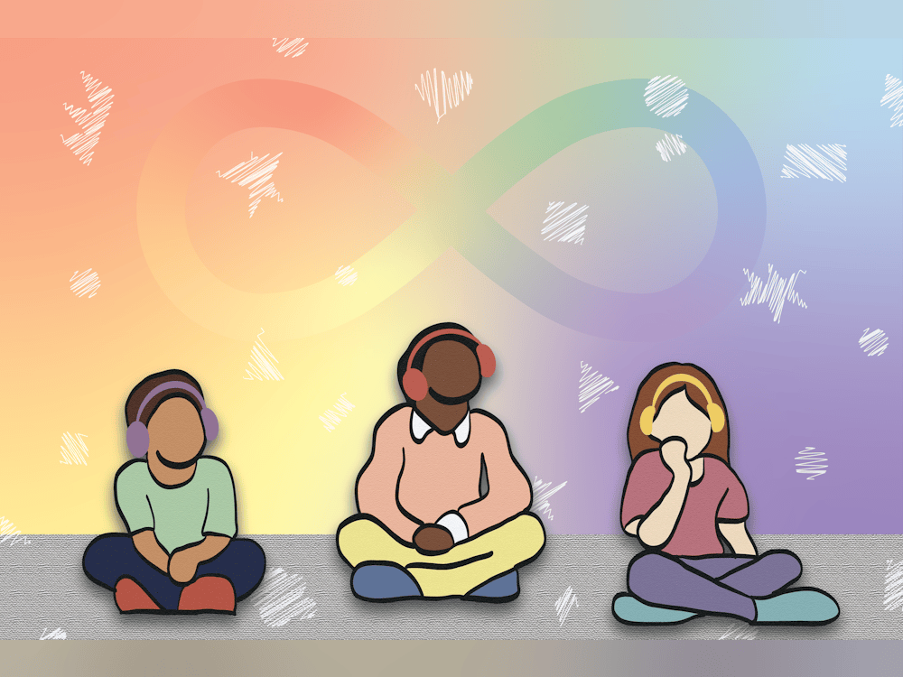
I design for nervous systems that get overwhelmed by glare, noise, motion, and visual clutter. That means calmer layouts, controlled contrast, reduced animation, and predictable visual rhythm. Less jump-scare design, more steady cues.In physical environments it means considering lighting, acoustics, and quiet areas as real accessibility features. I am to build experiences that lower vigilance so people don’t have to brace themselves just to participate.
Image 4: Shreya Senthilkumar (2024)
-
![]()
Cognitive Access
ADHD | BRAIN FOG | STRESS | TRAUMA | DECISION FATIGUE
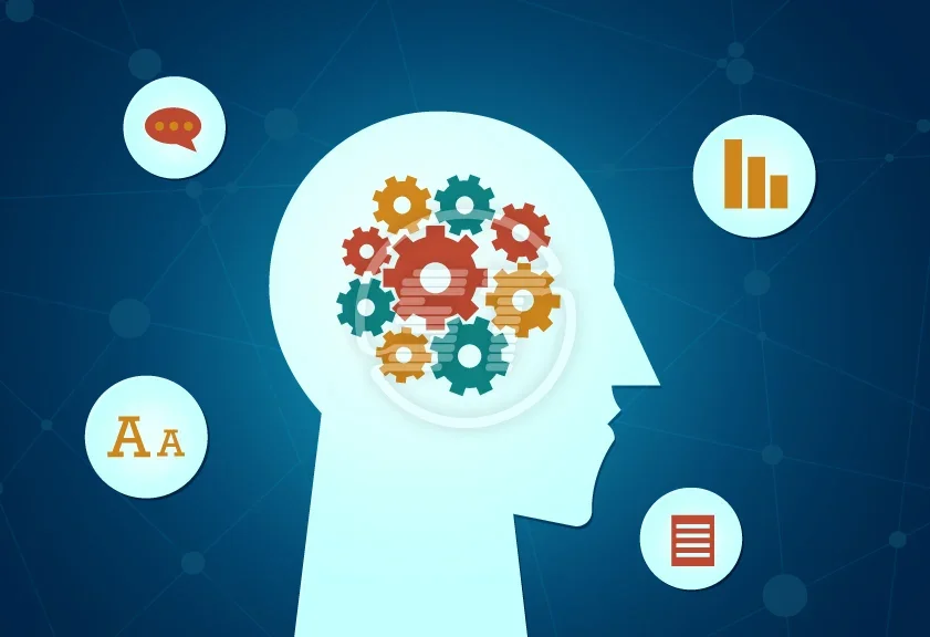
I design for ADHD, brain fog, trauma load, and decision fatigue by reducing the amount of thinking required to take the next step. I use clear hierarchy, chunked information, short pathways, and “what happens next” reassurance at every stage.I remove unnecessary choices, simplify forms, and build in tolerance for mistakes because humans simply are not machines. The goal is to make “I can’t do this right now” less likely to happen.
Image 5: Bhimani (2025)
-
![]()
Language Access
PLAIN ENGLISH | ACRONYM DETOX | LITERACY ASSUMPTIONS
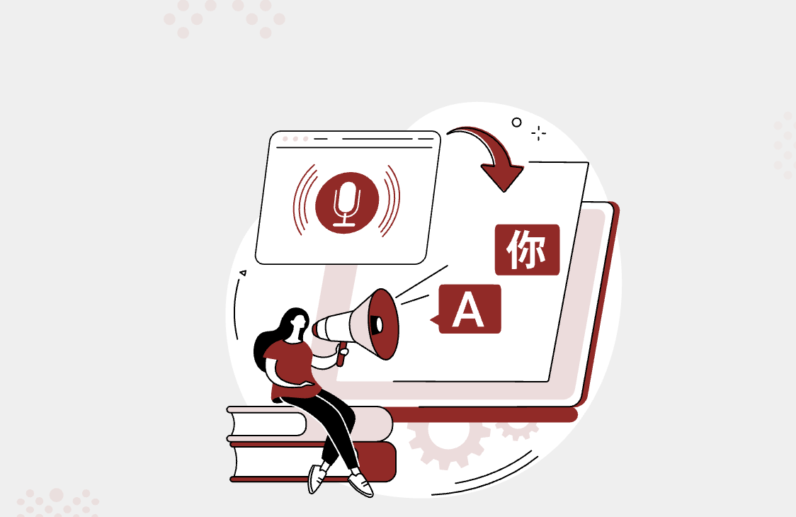
I design language like it’s part of the interfact, because… well, it is. I use plain English, define necessary terms, and run an acronym detox (of sorts) so people aren’t locked out by insider shorthand.I write and design with literacy assumptions in mind: scannable headings, simple sentence structure, and clear labels that match what people actually search for. My aim is for people to understand without needing to translate the experience in their head.
Image 6: Continual Engine Team (2025)
-
![]()
Cultural Access
“PROFESSIONALISM” NORMS | CLASS
I design for the people who’ve been taught they’re “too much,” “not the target,” or “not professional enough" to ask questions. I watch for class cues and professionalism norms that quietly signal who belongs, then soften those gates through tone, imagery, and clearer pathways.
I build reassurance into the whole experience. This is through permission-giving microcopy, transparent processes, and easy ways to ask without feeling foolish. My goal is to make help-seeking feel safe, not socially risky.
Image 7: Chandler and Johnson (2023)
-
![]()
Financial Access
HIDDEN FEES | PUNITIVE TRIALS | PRICING PROCESS
I design for budgets and uncertainty by making cost and process clarity part of the user experience, not some hidden reveal. I avoid punitive trials, surprise fees, and confusing steps that trap people into accidental commitments.
I plan transparent pricing structures where possible (if required/asked), or a least transparent “how it works” explanations with clear expectations. The aim is to reduce the money-stress spiral that turns “maybe” into “never.”
Image 8: Breaking the Barriers to Online Financial Services Accessibility (2025)
-
![]()
Technological Access
OLD PHONES | SLOW INTERNET | TIMEOUTS | BUSINESS HOURS ONLY
I design for old phones, slow internet, and people who don’t have time to fight a website at 2% battery. That means lightweight pages, readable layouts that don’t rely on overly-fancy effects, and forms that don’t punish pauses with timeouts.
I avoid business-hours-only gates by offering multiple contact options and asynchronous pathways (email, enquiry forms, accessible FAQs, etc.). The goal is for access to not depend on perfect tech or perfect timing.
Image 9: My own image
-
![]()
Identity Access
NAMES | PRONOUNS | SAFETY
I design for real identities, including correct names, pronouns, and options that don’t force people into “Other” like a social exile. I plan forms and flows that don’t require someone to lie to complete basic tasks, and I treat safety as a design requirement.
I choose language and imagery that signal inclusion early, before a person has to ask if they’re actually welcome. My goal is dignity by default: you shouldn’t have to explain yourself just to exist in the system.
Image 10: Team Mastertej (2021)


Dignity as a Design Output
What is Dignity?
I define dignity as a design outcome: privacy, competence, pace, choice, and aesthetics working together so people can get what they need without being exposed, rushed, or made to feel like a problem.
Privacy is practical. It happens by not over-collecting personal details, forcing unnecessary disclosure. Privacy aligns with the CRPD, which treats dignity, autonomy, and privacy as core rights rather than optional extras (United Nations, 2006).
Competence means the experience helps people succeed (especially those who are tired, in pain, foggy, etc.) through clear guidance and humane error recovery. Neusesser and Sunwall (2023) usability heuristics and error-message guidance explicitly emphasise plain language, constructive feedback, and respecting user effort.
Pace means there is no punishment for moving slowly, and WCAG (2025) suggests timeouts exist for exactly this reason: time limits can create barriers, especially for people with disabilities who need more time to read or complete tasks.
Choice allows for more than one way to find or complete something within the design, which WCAG’s (2025) “Multiple Ways” criterion supports because different people need different paths to the same destination.
Aesthetics matter too. Not just as decoration, but as part of welcome and trust. Research on the aesthetic-usability effect shows visual design shapes how usable something feels, which is why accessible design can (and should) be both beautiful and genuinely usable (Moran, 2024).
Does this design make people feel capable?
For me, one of the most important dignity tests in design is whether the person leaves the design interaction feeling capable… or corrected? When I’m dealing with pain, fatigue, or brain fog, confidence disappears fast, so designs that rely on speed, memory, or even “figuring it out” can make a simple task feel like proof that I’m failing. Really, it means the system is.
We should be supporting the opposite approach: reduce memory load through recognition (over recall), give people control and clear exits, and help them recover from errors instead of trapping them in shame loops.
“No punishment for moving slowly” is also an accessibility issue, not just another preference. Timeouts are barriers (especially for users who need more time).
Accessible design does not have to look clinical. Good aesthetics can support usability and trust, but the goal is beautiful clarity, not beauty masking friction. “Sterile” is a style choice, not an accessibility requirement.
That’s why I keep returning to the question, “Does this design make people feel capable?” Capability is often the first thing friction steals. A rushed flow, tiny tap target, confusing form, or a timeout doesn’t just interrupt the task; it tells the user they are too slow, too much, or not competent enough to continue. That message lingers long after the screen is closed.
I know how quickly that feeling can turn into avoidance (especially on low-energy days) which is why I design for humans. My designs support people instead of testing them. In that sense, designing for capability is about protecting dignity, so people can move through the world feeling guided rather than judged.
Erasure Patterns
“If your design is a sensory ambush, your brand can’t claim calm.”
How do systems quietly exclude?One of the clearest signs of quiet exclusion is not just who complains, but who disappears. If a system says it’s “for everyone” yet only works smoothly for people who are fast, confident, tech-comfortable, etc., it’s usually designed for the easiest user and then mislabeled as universal. In practice, you can often tell who’s missing by the patterns they exhibit: repeated drop-off, high support dependence, low uptake from groups, and negative feedback (like “I gave up”). Exclusion can hide inside “normal” design decisions.
What are common patterns of design erasure?The common patterns are often small enough to look ordinary. “Just call us” sounds simple until you consider hearing, speech, processing, anxiety, pain, fatigue, relay use, background noise, or call-centre scripting. These barriers cause frustration for consumers with disabilities. When it comes to identity, inclusive forms is the most direct response. Many gender/sex questions are asked out of habit rather than necessity. Forms should include non-binary options, and designers should avoid using “Other” as the default catch-all because it signals inclusion while still socially sidelining people.
Why is neutrality a form of camouflage?“Neutrality” can become camouflage if the design looks standard, professional, and tidy, but the standards themselves are built around narrow assumptions around bodies, cognition, language, time, and identity. Disability justice is important here because it pushes the conversation beyond compliance into intersectionality and collective access. Exclusion is not only about mobility and it rarely shows up in one dimension at a time. Not everyone navigates or understands information the same way. When a system feels “normal” only to the people it was unconsciously modelled on, exclusion doesn’t disappear, it just becomes harder to name.
Non-Negotiables
My non-negotiables exist because access isn’t a preference. It’s a human rights and participation issue. Design decisions can either widen or narrow someone’s ability to move through the world with dignity.
Universal design frames equitable access as a deliberate design responsibility that aims to reduce discrimination by design (not simply add special “fixes” late) (Imrie, 2012). and research in the built environment links access directly to health, social participation, and the realisation of rights (Watchorn et al., 2019).
Inclusive design scholarship is blunt about patterns I’ve seen over and over again: designers often default to able-bodied norms and inclusion gets “negotiated” late in the process, even though people are disabled by environments and systems that ignore the full range of human capability (Keates et al., 2000; Clarkson & Coleman, 2010; Clarkson et al., 2023).
Disability justice pushes this further by reminding us that access is collective, intersectional, and led by those most impacted (Berne et al., 2018) so my refusals and commitments aren’t style rules, they’re my own ethical line in the sand.
-
Confusion as a personality trait
Aesthetic purity that requires pain
Systems that only work for the confident
“One way” processes that force a single pathway
Forms that force people to lie about who they are
Beautiful work that fails real bodies, brains, and days
Accessibility treated as an add-on, apology, or last-minute patch
“Neutral” design that excludes and calls it normal
-
To design for worst days, not best-case users
To test accessibility early, not apologise later
To build systems that stay accessible over time
To translate complexity into clarity without losing nuance
To treat access as hospitality
To reduce threat, guessing, and vigilance through clear cues and steady structure
To offer multiple ways through whenever possible
To use language that welcomes, not gatekeeps
To design with dignity at the centre
My Design Superpowers
-
Authenticity
Compassion
Diversity
Equality
Health
Learning
-
Adaptability
Authenticity
Communication
Diversity
Integrity
Equality
Meaning
Originality
Transparency
-
I design for the human (think about what happens inside someone using the “thing”)
I’m strategy-led (anchor visuals to purpose, positioning, and clarity
Systems brain (naturally build identity, content, and design systems that can scale)
Translating complexity into clarity
Storyteller
Detail-aware
Accessibility-minded (by default)
Process-driven
Interdisciplinary (speak to different creative fields and translate them across them)
Resilient
Adaptable
-
Human-First Design
Designing around real people’s emotions, needs, and decision-making, not specifically ideal users or “perfect conditions”
Clarity Through Empathy
Use of compassion to spot where people hesitate or get overwhelmed, then transform complexity into calmness and clarity
Systems Over Chaos
Building flexible brand and content systems that keep work consistent, efficient, and sustainable as things grow, change, and develop
Accessible By Default
Accessibility as a starting point by prioritising readability, inclusion, and ease of use so more people can participate
Honest, Strategic Storytelling
Crafting story and strategy that communicates what’s real with integrity, helping audiences trust the brand/design without being pushed